
photo manipulation
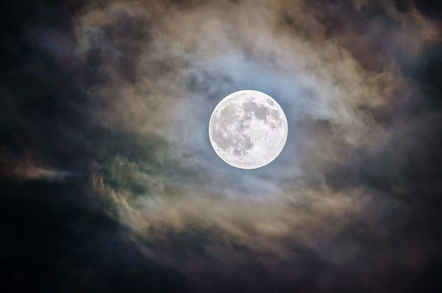
This week we were taught photo bashing and told to create a piece that did not look as if it was edited, I had two attempts at this, the first of which was a mountain under a cloudy night’s sky
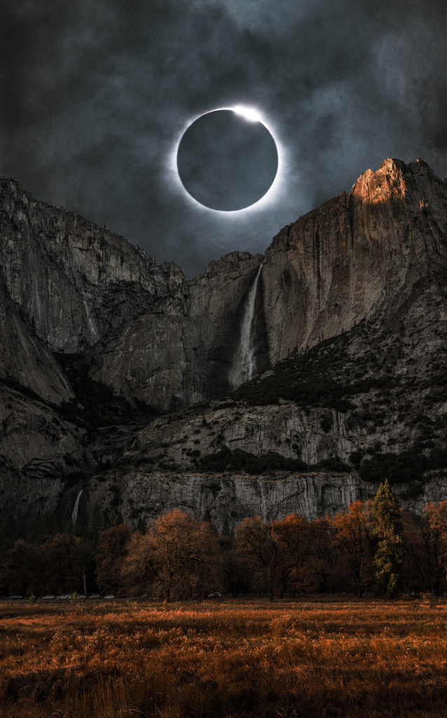
While I believe at a first glance this piece may be believable the lighting does not blend together and due to the lighting and brightness you are able to tell apart the two different images in the piece, also the final product looks somewhat boring being just a background image with nothing in the foreground to draw attention.
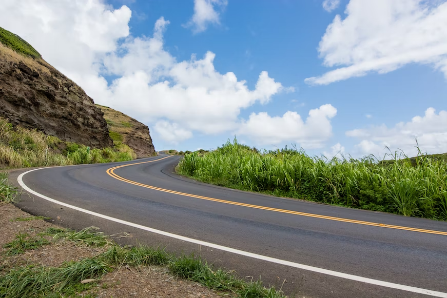
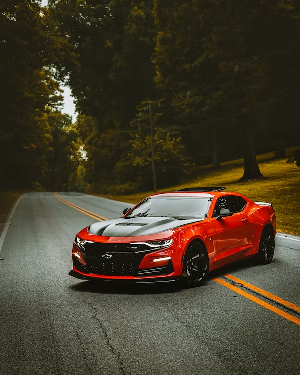
for my second image I combined three images, a night sky, a road, and a car.
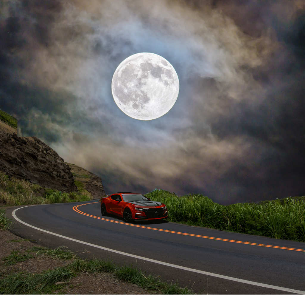
I believe that this was an improvement to my first attempt as I the background blends together better and the lighting all seems to fit and the car in the foreground draws the attention from any imperfections in the background.
However there are some problems where I edited the bright sky to match the dark sky, i feel like if i attempted again I would take more time to make sure that the grass did not interfere with the background and sky colour.
The third piece i made was making a bright and colourful image sad and depressing
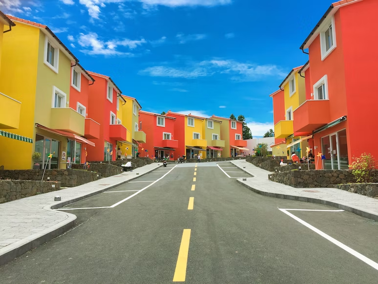
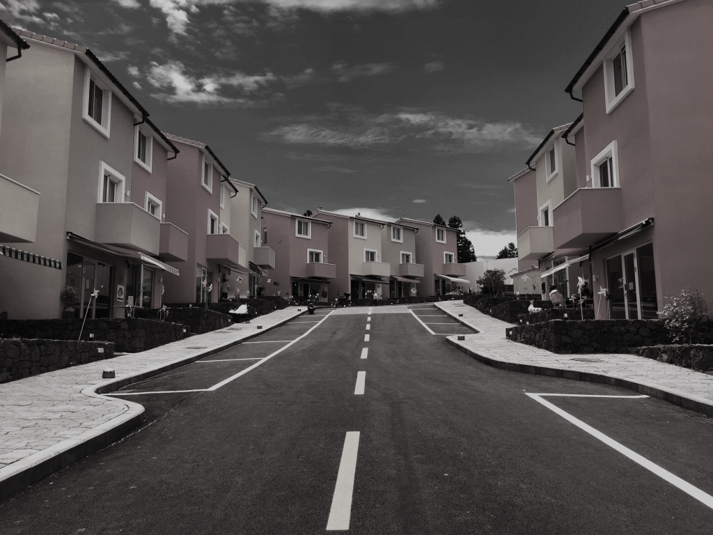
for this image I increased the brightness and lowered the saturation to make the bright buildings look grey and much less bright while keeping the light level, I then lowered the vibrance and lowered the saturation of blue even further to make the bright blue sky look grey and darker.
i got all of these images from https://unsplash.com/